Building notes: Remaking a piece of subway art that I had to stare at for a long time (because Boston transit can be like that sometimes)
Exactly as my Lana Del Ray-like song title suggests. What again was supposed to be silly turned to be an interesting adventure.
Introduction
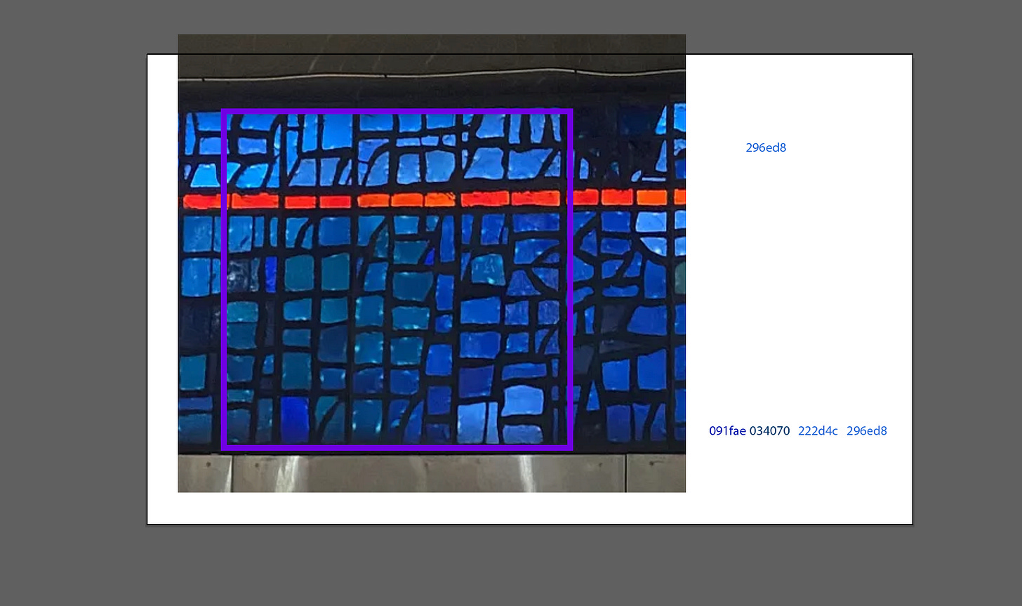
My wife and I were waiting to take the bus (77) to Arlington for a double date. While my wife was reading (therefore not wanting me to interrupt her) I resigned myself to looking at this large mosaic art piece, which was probably meant to offset the concrete drabness of the underground bus stop. Pretending that this was my There’s a Tunnel under Ocean Boulevard moment, I stared at it:
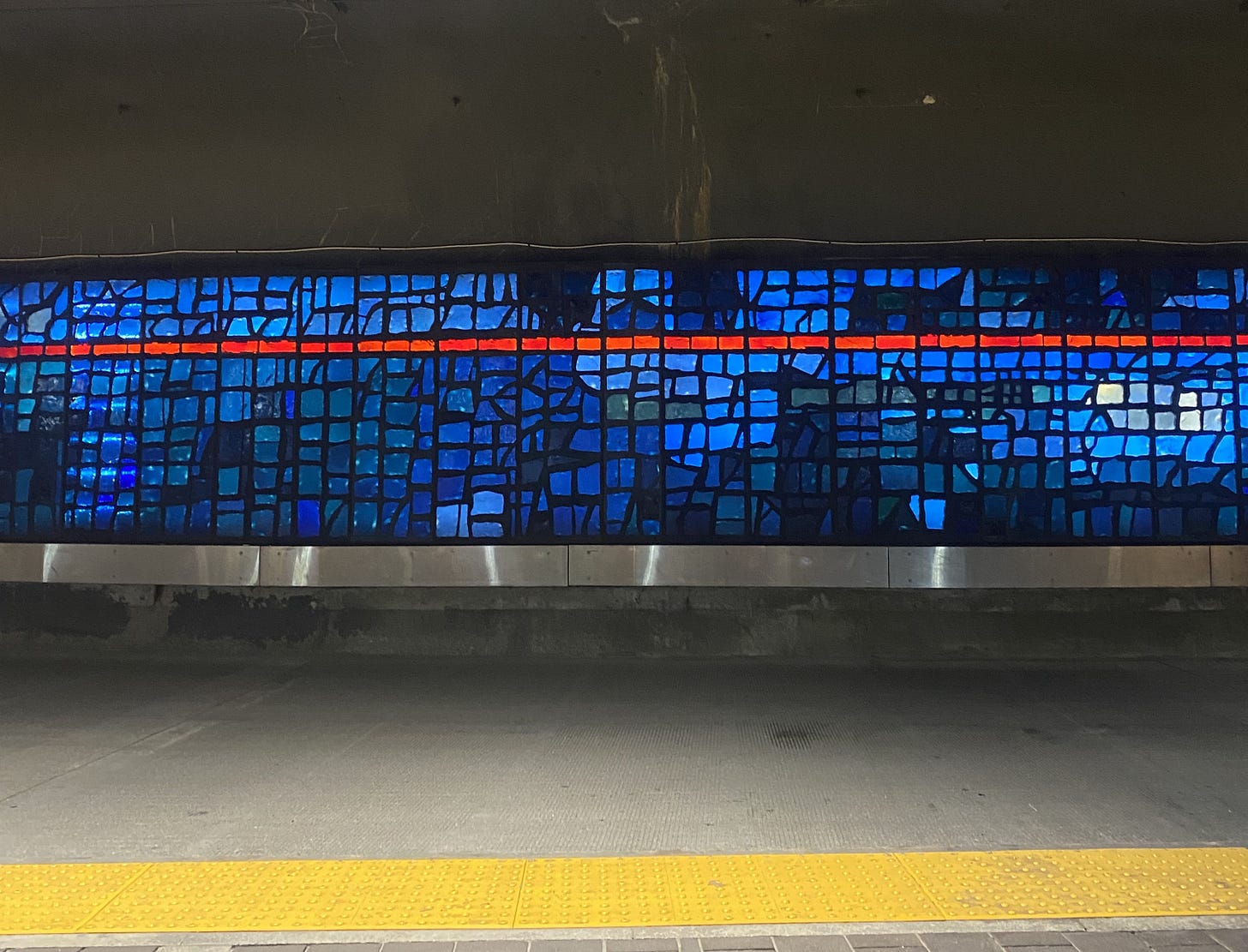
The art still maintains a grid structure, even though there’s a lot of organic paths within each panel. Out of boredom, I wondered how I would remake this in ggplot. A few minutes passed before I got frustrated and turned to my wife to ask how she would do it. With much of her attention focused on her book, she took the quickest glance up:
‘It looks like a Voronoi diagram.’
She turned her attention back to her novel.
Voronoi Diagrams
A Voronoi diagram is a way of dividing a space into regions based on distance to a set of generating points. It’s found in nature and has some really fun mathematics behind it. Highly recommend watching the video below:
I originally thought I would have the fun challenge of coding up the Voronoi cells (the algorithm is pretty interesting for anyone wanting to take a look). Unsurprisingly, we actually have a ggplot2 extension package for it: ggvoronoi.
Yesterday I started to code. Looking up from her novel, my wife again gave her recommendation:
“I’ll just start with a grid and add some noise”
generate_panel <- function(){

#Originally start with a grid
x =  seq(1,3)
y =  seq(1,3)
xy_df <-expand.grid(x=x, y=y)

#Add some gaussian noise
xy_df$x = xy_df$x + rnorm(3,mean = 0, sd = 0.25)
xy_df$y = xy_df$y + rnorm(3,mean = 0, sd = 0.25)

return(xy_df)
}
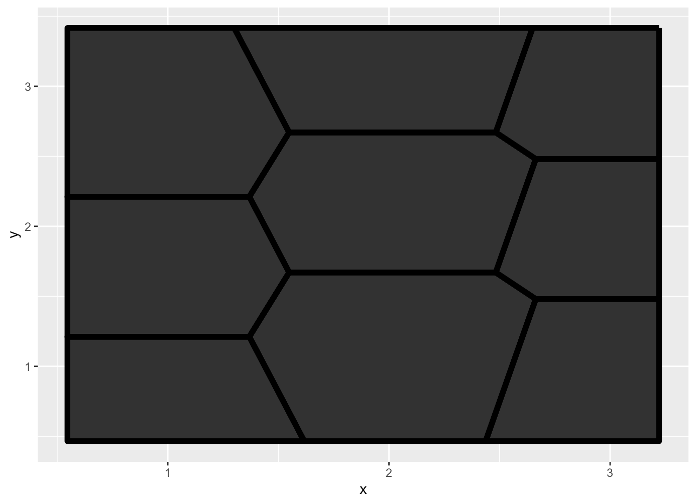
So I basically make a 3×3 ‘grid’ (more like centroids), then for each centroid I add a bit of Gaussian noise:
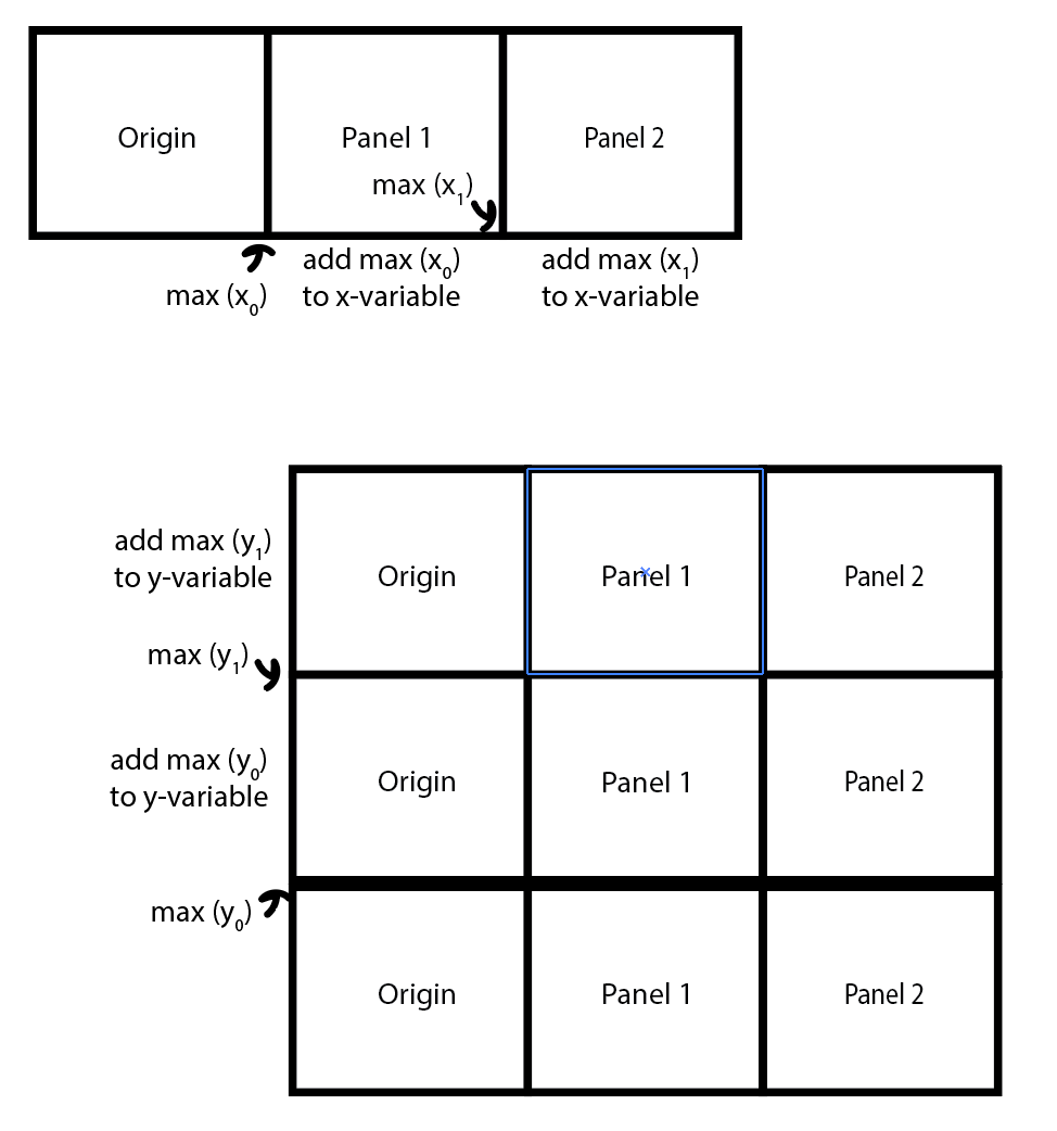
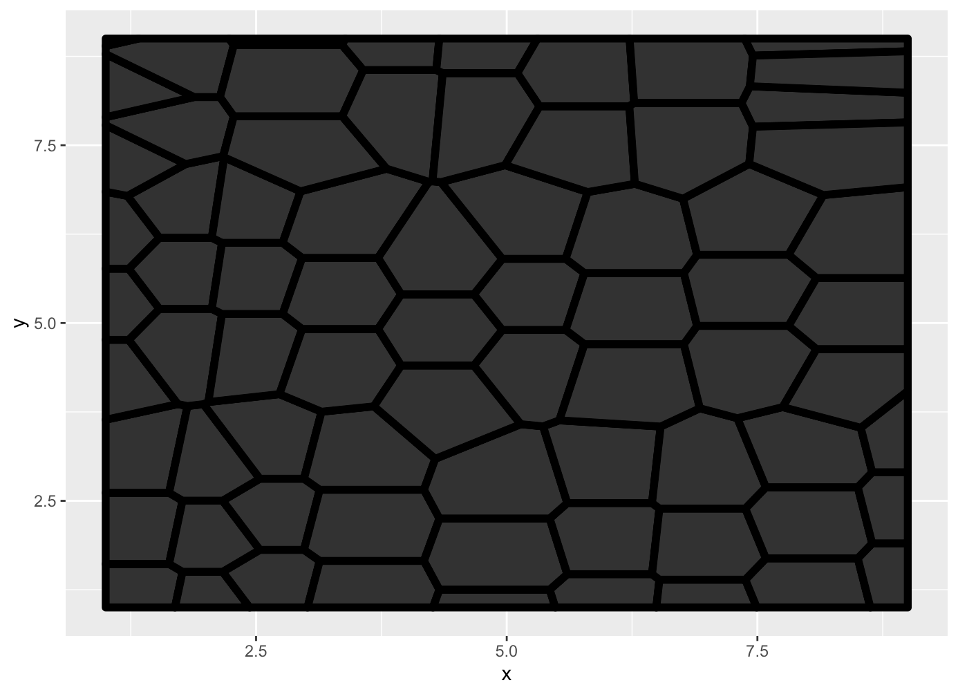
Ok, it’s taking shape. This is an individual panel that would make up the larger square, but I want to ‘stack’ it. I found that if I create all of the Voronoi cells at once, it does not look like the art. So I need to separately generate a panel and combine them with each other, like this schematic shows:
Basically, I make the origin panel. I find the maximum x-value and add that to the x-values of the next panel (Panel 1) that I generate. Then I find the maximum x-value of Panel 1 and do the same thing with Panel 2. I’m joining the panels left to right, and then I stack these three panels on top of each other. I then join all of these into one data.frame:
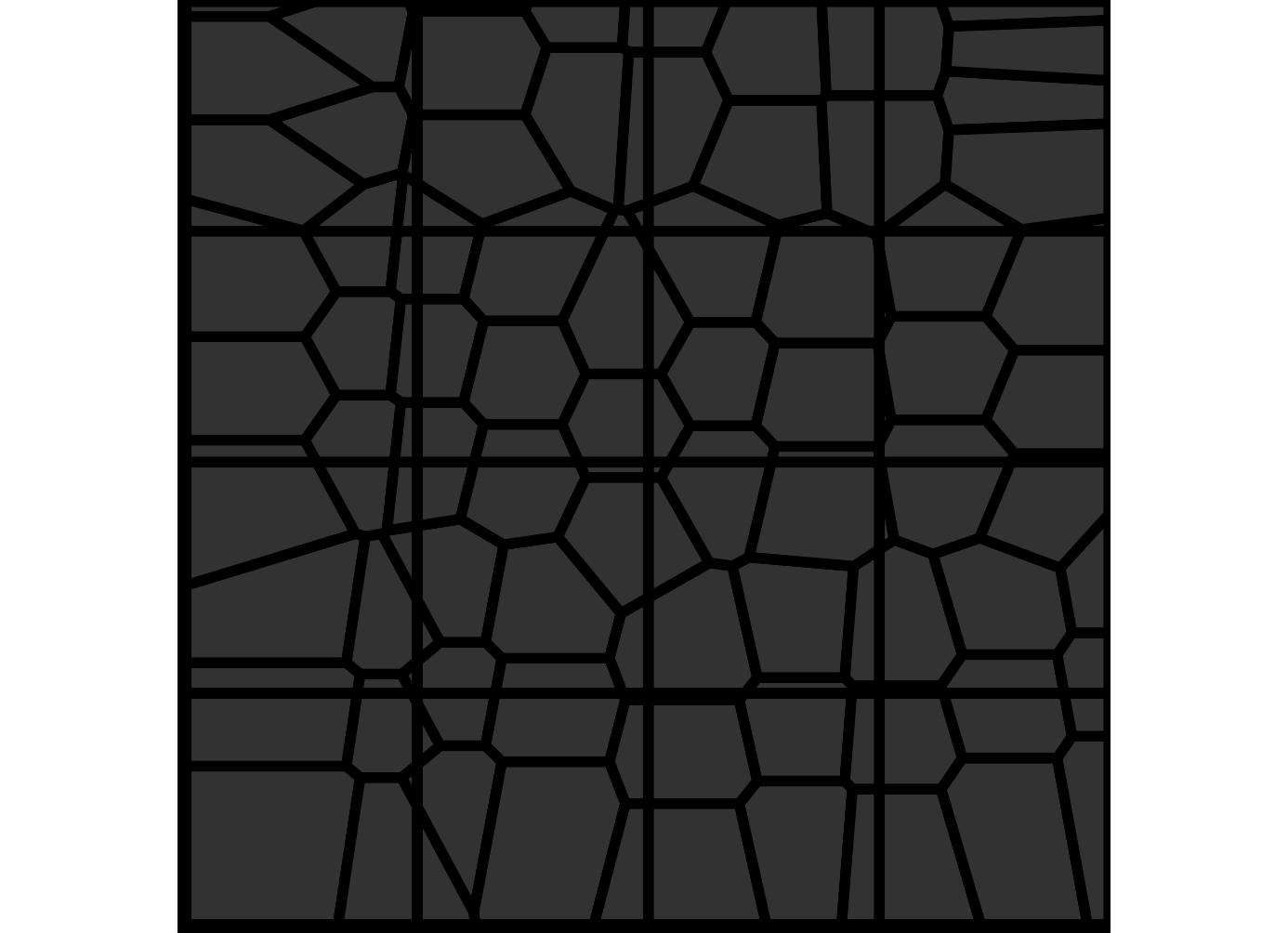
Ok now I’m going to overlay another grid on top. I’m not sure how any of this works and honestly, I just fiddled with it until it looked good:
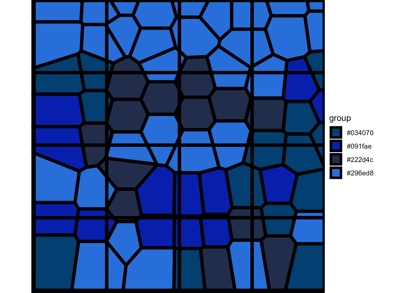
Now to add color. I’m going to my handy-dandy Illustrator. I picked a part of the panel that I liked and selected the colors with my eyedropper tool. I can’t really see a coloring pattern, but I do see that the lighter blues dominate the top, while the darker blues are on the bottom. So I might let R sample them instead of picking the space individually. But I’ll make it so that the top panels are going to get all the same color:
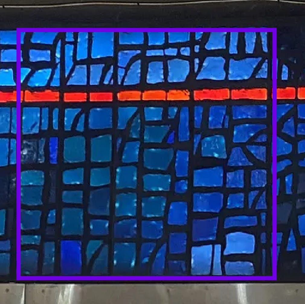
I also added the red band in. But I realized that it looks very flat. Look at this photo:
Notice that it’s quite splotchy!
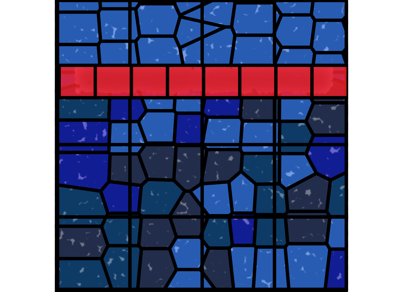
To mimic this I generated a lot of random points. ‘points’ is for the entire square while ‘points_2’ is specifically for the red-banded area.
I realized that if I lower the opacity of the front-facing layer, I can give the illusion of texture, with the clustered points in the back automatically creating some lighted areas. I also used {ggfx}, which allowed me to put a glowing effect on these points (I’m not sure if it does anything, but it’s just an interesting package). It’s not perfect but I think this sells the illusion a lot better.
But I think this will be a fun challenge for people.
The messy code below:
library(ggvoronoi)
library(rayshader)
set.seed(24601)

generate_panel <- function(){
#Originally start with a grid
x =  seq(1,3)
y =  seq(1,3)
xy_df <-expand.grid(x=x, y=y)

#Add some gaussian noise
xy_df$x = xy_df$x + rnorm(3,mean = 0, sd = 0.25)
xy_df$y = xy_df$y + rnorm(3,mean = 0, sd = 0.25)

return(xy_df)
}
connect_left_right <- function(){
  origin_panel <- generate_panel()
  far_right_point_1 <-max(origin_panel$x)

  panel_2 <- generate_panel()
  panel_2$x <- panel_2$x + far_right_point_1
  far_right_point_2 <- max(panel_2$x)

  panel_3 <- generate_panel()
  panel_3$x <- panel_3$x + far_right_point_2
  far_right_point_3 <- max(panel_3$x)

  panel_all <- rbind(origin_panel, panel_2, panel_3)

}
generate_total <- function(){

  colors <- c("#091fae","#034070","#222d4c","#296ed8")


  bottom <- connect_left_right()

  bottom$group <- sample(colors, nrow(bottom), replace = TRUE)

  middle <- connect_left_right()
  middle$group <- sample(colors, nrow(middle), replace = TRUE)


  top <- connect_left_right()
  top$group <- "#296ed8"
  top_point_1 <- max(bottom$y)

  middle$y = top_point_1 + middle$y

  top_point_2 <- max(middle$y)

  top$y = top_point_2 + top$y

  all_grid <- rbind(bottom, middle, top)

}


xy_all <- generate_total()

grid_overlay <- expand.grid(x=seq(1.2,7.9,length=4),
                            y= seq(1.2,7.9,length = 4))

outline <- data.frame(x = c(0, 9, 9, 0),
           y = c(0, 0, 9,9))


grid_red_overlay <- expand.grid(x = seq(0.69, 8.5, length = 8),
y = c(6.5))


points <- data.frame(x= runif(9000, min = 0, max= 9),
          y= runif(9000, min = 0, max= 9))

points_2 <- data.frame(x= runif(1000,min = 0.69, max = 8.5),
                     y= runif(1000, min = 6.20, max= 6.9))


a <- ggplot()+
  with_outer_glow(
  geom_point(data =points ,
               aes(x = x, y =y),
             size = 3.3, alpha = 1,
            color = '#222d4c'),
  colour = 'white',
  sigma = 10,
  expand =1) +
  geom_voronoi(data = xy_all ,
               aes(x = x, y =y, fill = group),
               outline = outline,
               color = 'black', size = 2, alpha =0.7)+
  geom_tile(data = grid_overlay,
            aes(x =x, y=y),fill=NA,
            alpha = 1,color= 'black', size = 2)+
  with_inner_glow(
    geom_point(data =points_2 ,
               aes(x = x, y =y),
               size = 3, alpha = 1,
               color = '#222d4c'),
    colour = 'pink',
    sigma = 10)+
  geom_tile(data = grid_red_overlay,
            aes(x =x, y =y), fill ='#f31623',
            color = 'black', size = 2, alpha = 0.8) +

  scale_fill_manual(values = c(
    "#091fae" ="#091fae" ,
    "#034070" = "#034070",
    "#222d4c" = "#222d4c",
    "#296ed8" = "#296ed8"
  )) +
  scale_x_continuous(expand = c(0,0))+
  scale_y_continuous(expand = c(0,0))+
  coord_equal()+
  theme_void() +
  theme(legend.position = 'none')


a


