
Building notes: Linear regression viz in 3D
Listening to Chappell Roan’s new single “Subway” on an hour-long loop—can’t tell if I’m crying because of the song or the XQuartz installation error.

Introduction
One of my favorite books on linear regression is Applied Regression Analysis & Generalized Models by John Fox. I feel like it has enough theory and practicality, and I like going back to it every now and then. One of my favorite diagrams to introduce readers to linear regression is below:
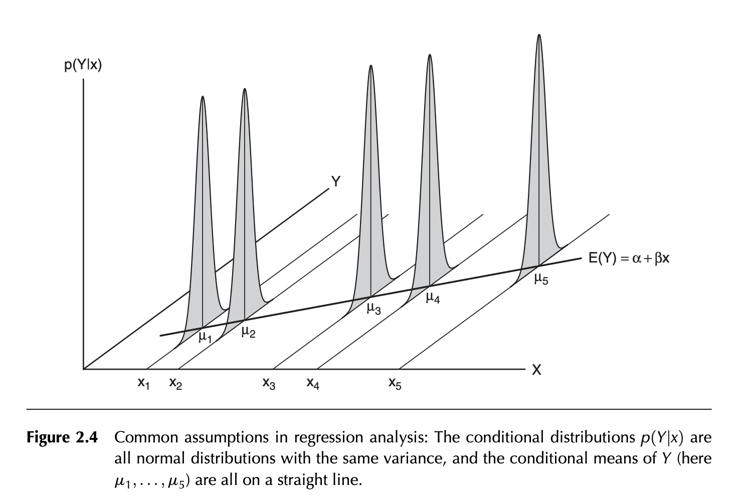
This figure just states the distribution of the response variable (Y), conditioned on a particular value of X, is normally distributed with equal variance regardless of the value of X (A violation of this assumption is referred to as heteroscedasticity). The expected values of Y (u1, u2, …, u5) is on the regression line.
I really love this plot and out of curiosity, I was wondering if I can replicate this plot in ggplot. The problem is that 3D plotting isn’t officially supported, so I was thinking of using the package Rayshader, which should be able to convert 2D ggplot2 plots into 3D. I’m typing this sentence right now and I’m betting 80% it doesn’t work! I won’t be focusing on the math behind this but just the plotting.
An aside: But simulating linear regression is a fantastic way to learn if you’re someone starting out in data science. I really recommend this old paper by Leroy Franklin who shows a step by step method for gaining insight!
Building plan
Attack Plan #1
Here, I’m simulating 100 observed values (Y) by setting the true known value of the intercept (alpha) and slope parameter (beta). Then we add random noise (error) drawn from a normal distribution:
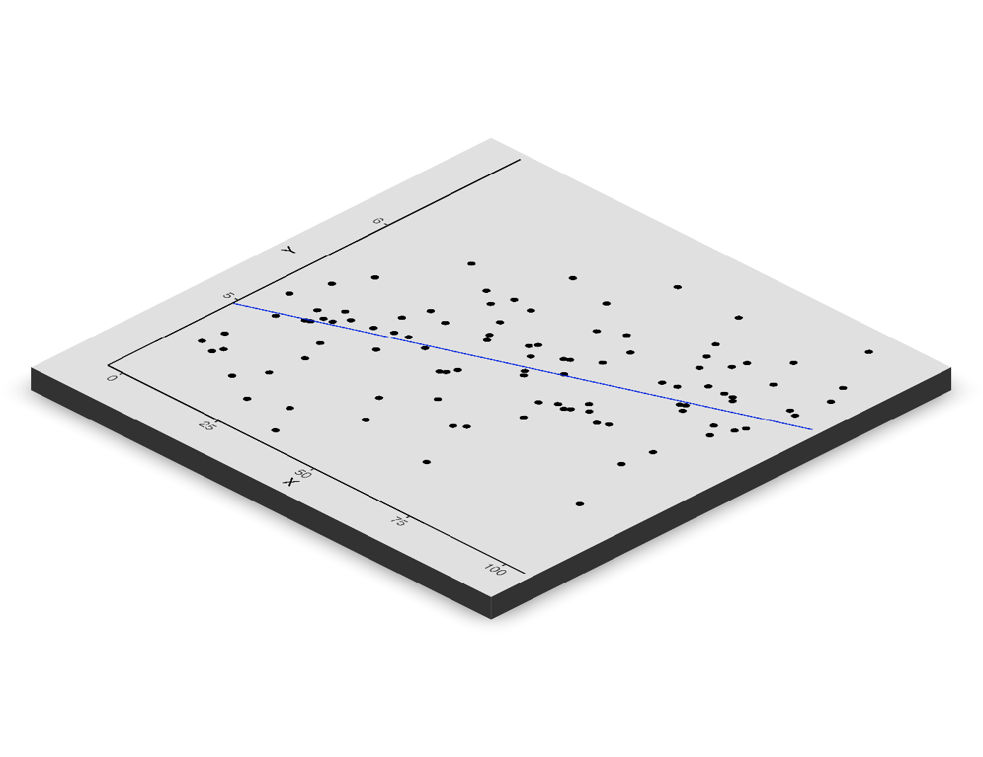
The blue line is then the regression line.
OK, cool—hm! This is where I’m suspiciously optimistic. But how do I add the curves representing the normal distribution? Okay, so this took about an hour of realizing I should not have used Rayshader. There’s a trajectory function (render_path) that suggests I should be able to make a curve. Nada, nothing could get the normal curves to appear.

Yes, I did run this problem through ChatGPT to see if I was perhaps missing an obvious answer. Of course, it gave me hallucinatory responses. From the documentation, I think I need to work with an sf object containing longitude and latitude to make this work. However, I’m not happy with that answer (or maybe it’s just laziness). I also wanted to stay within the ggplot2 framework, so I opted out of using plotly. I did find the package ggrpl, which seems more aligned with what I wanted.
Attack Plan #2
So I think I should have started with the ggrgl. The installation was a bit of a problem (the simplest fix is just restarting your computer after you install XQuartz). But the grammar is super simple. If you want to use a 3d point you just use: geom_point_3D instead of geom_point for example.
So I was able to plot the normal curves!
I'm not knocking rayshader - like I said, it's a super cool, powerful tool - I should have known better! But I'm so chuffed at finding ggrgl, it's super cool and I really love how natural of an extension it is! It’s also interactive!
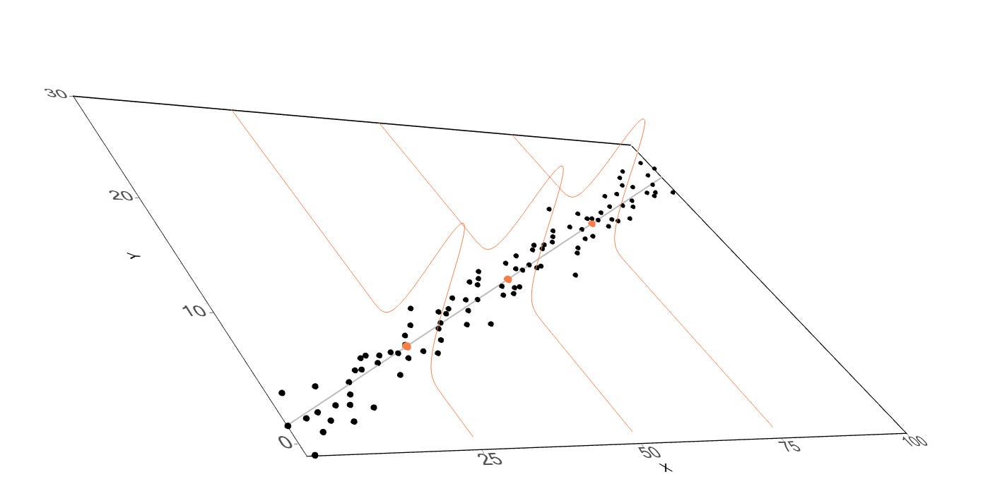
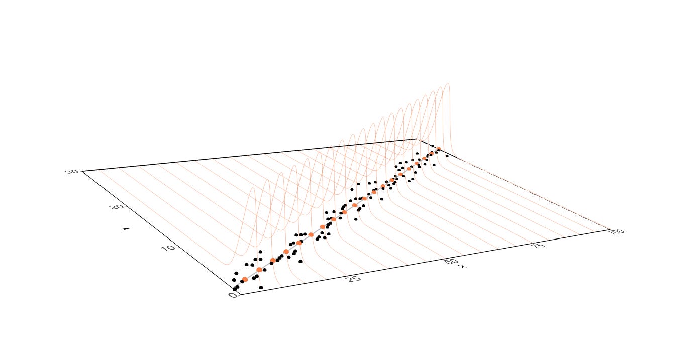
And we can put more of these orange normal curves if we wanted to:
Please if I got anything wrong, please let me know!
The full code here:
# Load libraries
library(rgl)
library(devout)
library(devoutrgl)
library(ggrgl)
library(ggplot2)

# If you just installed XQuartz- RESTART your computer
# or Rstudio will crash.

# This simulates the observed Y variables where alpha is the
# intercept, beta1 is the slope, and error_sd is the standard
# deviation of the error.
simulate_obs_Y <- function(alpha, beta1, error_sd) {
  n_sample <- 100 # Total number of observations
  error_n <- rnorm(n_sample, mean = 0, sd = error_sd)

  return(data.frame(
    predictor_x = 1:n_sample,
    observed_y = alpha + beta1 * (1:n_sample) + error_n
  ))
}

# This simulates the observed Y variables where alpha is the
# intercept, beta1 is the slope, and error_sd is the standard
# deviation of the error.
generate_normal_curves <- function(alpha, beta1, error_sd, interest_x = seq(5, 100, 5)) {
  y_seq <- seq(0, 30, length.out = 1000) # The y-axis part
  curves <- lapply(interest_x, function(x_val) {
    mu <- alpha + (beta1 * x_val) # The mean
    data.frame(
      x = x_val,
      y = y_seq,
      z = dnorm(y_seq, mean = mu, sd = error_sd) # normal distribution
    )
  })
  return(do.call(rbind, curves))
}

# Parameters
alpha <- 1
beta1 <- 0.25
error_sd <- 1

# THE DATA
observed_point_df <- simulate_obs_Y(alpha, beta1, error_sd)
normal_curves <- generate_normal_curves(alpha, beta1, error_sd)
regression_line <- data.frame(x = (1:100), Ey = alpha + (beta1 * (1:100)))
regression_line_points <- subset(regression_line, regression_line$x %in% seq(5, 100, 5))

# THE PLOT
plot_GG <- ggplot(
  observed_point_df,
  aes(x = predictor_x, y = observed_y, z = 0)
) +
  geom_line(data = regression_line, aes(x = x, y = Ey), color = "grey", size = 2) +
  geom_sphere_3d(size = 2, extrude = TRUE) +
  geom_path_3d(
    data = normal_curves, aes(x = x, y = y, z = z, group = x),
    color = "coral",
    size = 10, alpha = 0.5
  ) +
  geom_sphere_3d(data = regression_line_points, aes(
    x = x, y = Ey, z = 0
  ), color = "coral", size = 3) +
  theme_classic() +
  xlab("X") +
  ylab("Y") +
  scale_x_continuous(expand = c(0, 0)) +
  scale_y_continuous(expand = c(0, 0)) +
  theme(
    axis.text = element_text(size = 15),
    panel.border = element_rect(linewidth = 1.2)
  )

devoutrgl::rgldev(fov = 30, view_angle = -30)
plot_GG
invisible(dev.off())
Fun after credits
POV you’re me: